40 Maps That Explain The World


The 40 maps featured in this Washington Post article analyze the world from many unique perspectives such as the best and worst places to be born, most and least ethnically diverse countries, and how the US compares to the world on economic inequality. Here are two fascinating examples below. Click here to see all 40 maps.
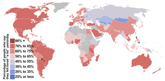
Where people feel the most and least loved (click map to enlarge)

Gay rights around the world (click map to enlarge)